Product Overview.
Challenges.
A clunky website experience
Toyota’s Certified Used Vehicles website needed a serious tune-up. The existing site was old, outdated and lacked the technical integrations required to make it competitive with other car manufacturers focused on dealerships.
Searching for vehicles was very clunky and difficult to do on the current site, including finding vehicles that were located close by. It was also challenging to compare two different vehicles, a feature in high demand for those looking to buy a pre-owned car.
Missing crucial digital features
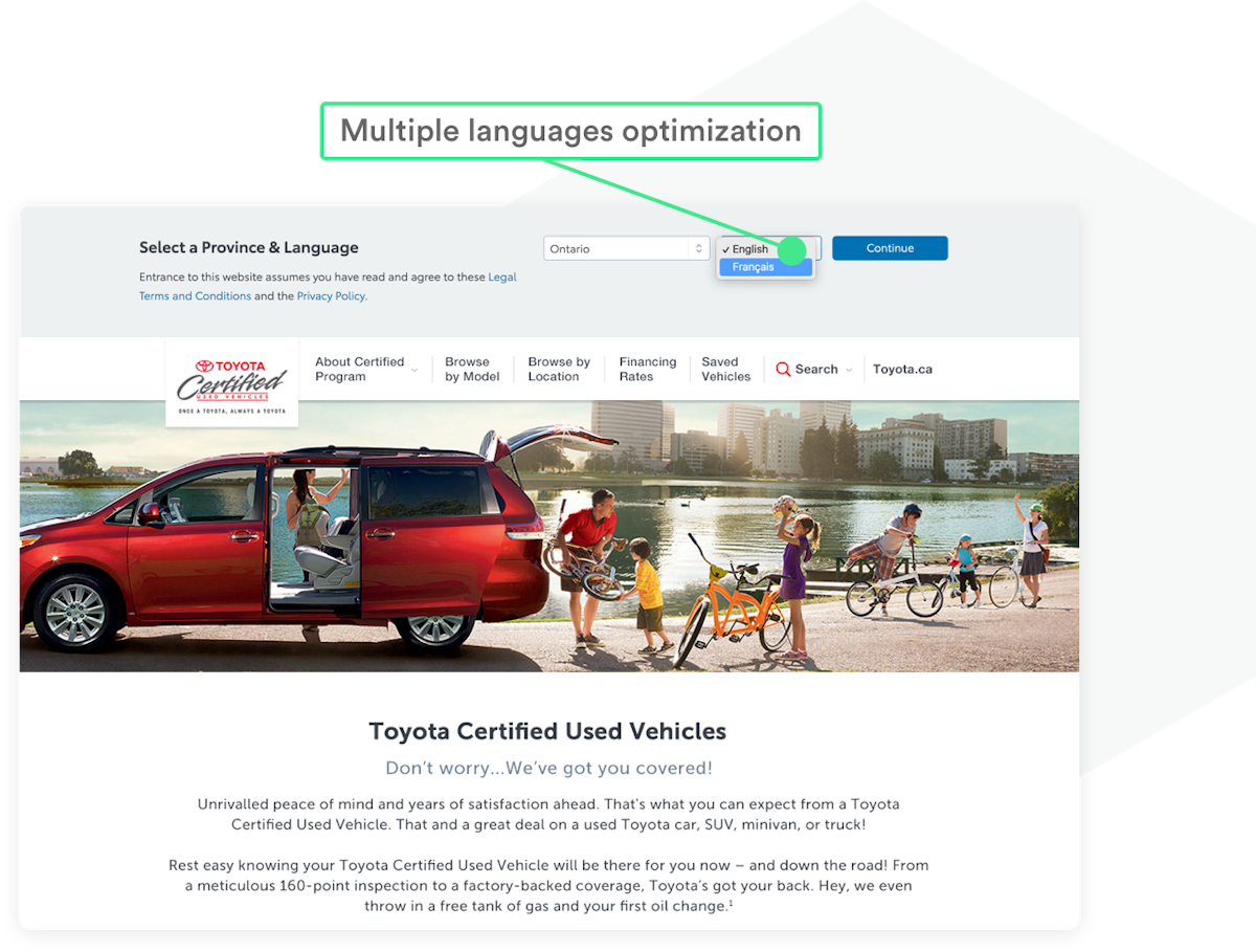
The site wasn’t responsive either, meaning the user experience on mobile and tablet devices wasn’t optimal, and the site also wasn’t bilingual, so it couldn’t cater to the French Canadian market.
The team at Toyota Certified Used Vehicles needed a new site with a sustainable, future-proof design and a clean, modern look that would be fit for purpose for the foreseeable future.

Crafting beautiful design systems
The team also created a design system for the Toyota Certified Used Vehicles site, developing shells of each page which were then converted into component parts. The Toyota team was able to use this content library to build new pages on the site as and when they were needed.
This design system helps maintain brand consistency throughout the site and allows the internal team to easily create new website content without any additional design or development support.


Optimizing search functionality


Making the site available in multiple languages


Custom Google Analytics implementation

Results
The Brain Box team created a sleek user interface that enhanced the current design system that significantly increased conversion on the Toyota Certified Used Vehicles website.
The enhanced user experience nearly doubled the conversion finding a certified used vehicle, far exceeding our initial 25% estimate.
Big thank you to the Brain Box team - the site looks great, especially on mobile (and I'm testing on 40+ OS/browser configurations). Thanks so much for doing such a great job!


