A Complete Overview on Data Visualization Tools
Kris Nicolaou, January 27, 2023
Data visualization is an excellent tool for communicating complex information in an easily digestible form. According to Forbes, over 2.5 quintillion bytes of data. are produced daily, growing each day as more people become connected in the digital world.
Data visualization makes it possible to process this staggering amount of data quickly and accurately by turning it into visuals you can readily understand at a glance. It enables us to identify trends, patterns, correlations, outliers, and more that would otherwise remain hidden beneath layers of raw numbers. With the help of modern tools, anyone with access to big data can quickly produce stunning visualizations.
In this article, we'll look at some popular tools used to create data visualizations today.
Key Takeaways
- Data visualization is great for identifying trends and patterns. Using these tools will allow its users to adjust their strategies accordingly to make them more efficient.
- You will gain invaluable insight into data visualization. You can use these technologies to understand better raw data that would be near impossible to understand.
- You can incorporate colors in your visualization to be more effective. Color coding your data visualization will allow you to see trends and patterns quickly. Doing so will get you ahead of your competition.
What is data visualization?
Data visualization is the process of converting complex datasets into visual representations such as graphs, maps, charts, and diagrams. That enables individuals to make sense of large amounts of data quickly and easily, identify trends, relationships, outliers, and confidential information, and draw meaningful conclusions.
Data visualization's goal is for people to understand data better in order to gain insights more effectively. You can use it for various purposes, including research, analysis, and decision-making. Presenting data allows users to explore and interact with it in ways that are impossible with just numbers or text alone. That makes it easy to find patterns, compare elements, and draw accurate conclusions from the datasets.
Data visualization is often used in combination with other analytical techniques, such as machine learning or artificial intelligence (AI). You can use AI algorithms to detect patterns in large datasets that might otherwise go unnoticed by humans. Data visualization then allows these patterns to be presented visually for easier comprehension.
Data visualization tools come in many forms, including software programs like Tableau or Microsoft Excel, online services like Looker Studio, or even libraries such as D3.js, which allow developers to create their own custom visualizations from scratch.
Regardless of the tool used, all successful data visualizations must adhere to certain design principles, such as using colors that don't overwhelm the viewer or labels that make it easy for viewers to comprehend the visuals quickly. Furthermore, adding interactive elements or animation features can significantly enhance the user experience when exploring complex datasets.
Types of Data Visualization Tools
Data visualization tools come in various forms, each designed for specific use cases. Some are best suited for exploring relatively small datasets, while others scale to massive amounts of data.
Here are the best types of visualizations and analytics tools you can use:
Tableau
Tableau is arguably the most popular data visualization tool for exploring, analyzing, and visualizing data. It offers an intuitive drag-and-drop interface with powerful features like filtering, sorting, mapping, and more. Tableau can connect to many different types of databases and datasets and provides a wide range of charting options for quickly turning raw data into beautiful visuals.
Microsoft Power BI
Microsoft's Power BI is another well-known tool used for producing interactive data visualizations from various data sources, including Microsoft Excel spreadsheets, SQL databases, cloud-based services such as Salesforce and Zoho Analytics, social media such as Twitter or streaming services like YouTube, and more. In addition to its extensive library of charts and graphs, it also offers support for advanced analytics such as predictive data modeling and machine learning.
Looker Studio
Looker Studio is a cloud-based data visualization tool that helps users take their datasets and turn them into interactive dashboards and infographics. It can be connected to almost any data source, and its library of Google charts, tables, histograms, and maps is customizable with colors and font sizes for ultimate flexibility. In addition to this, it also offers features such as real-time collaboration, custom alerts, and an interactive drag-and-drop interface for quickly creating visuals from your data.
D3.js
D3 (Data-Driven Documents) is another excellent option. It is an open-source JavaScript library designed to produce dynamic interactive data visualizations on the web. Due to its flexibility and scalability, it has risen as one of the most popular tools for creating custom data visualizations. With D3, developers can connect to existing APIs and create complex visualizations with animation, interaction, zooming, and more features.
Brain Box Labs
Brain Box Labs is a powerful data visualization platform designed to help users quickly explore, analyze, and visualize their datasets. Their team of JavaScript developers ensures that you get accurate visualizations optimized for performance and scalability. Brain Box Labs makes it easy to turn your data into meaningful insights with a wide range of interactive chart types, custom styling, and interactive elements. They are also proficient in data science, CSS, and HTML, ensuring you get the functionality you need.
Microsoft Excel
Microsoft Excel is a versatile spreadsheet program that beginners can use to create different charts and graphs and more complex data visualizations. It's easy to use and integrates seamlessly with other apps like Microsoft Office programs like Word and PowerPoint. With Excel, you can easily manipulate large amounts of data, making it especially useful for creating financial models or running statistical analyses.
Qlik
Qlik is a business intelligence and data visualization software that helps organizations create powerful insights from their data. It offers automated algorithms, advanced data analytics, and in-memory computing for real-time data analysis. You can use Qlik to create interactive data visualizations with drill-down capabilities, making it ideal for uncovering patterns or trends within your data.
Google Sheets
Google Sheets is a cloud-based spreadsheet application that you can use to create simple visuals from your data. It has a wide range of templates, charting options, and forms, making it easy to quickly turn raw data into beautiful visuals. Additionally, it offers features such as real-time collaboration for multiple users and automated formulas for rapidly manipulating data.
Chartio
Chartio is a data visualization and reporting tool for quickly creating insightful visuals from your datasets. It offers automated dashboards, natural language queries, dynamic filters, and more. Chartio makes it easy to intuitively explore complex datasets, allowing users to make decisive decisions quickly.
Each tool has its own advantages and disadvantages, depending on the use case. Evaluating which tool will work best for your specific formats is vital before investing in any of them. Data visualization provides powerful insights into data—but only if it's done right.
By mastering the fundamentals of data visualization, you can ensure that your visuals are meaningful, effective, and impactful. The power of data visualization lies in its ability to take complex or large datasets and give users a better understanding of their data.

Benefits of Using Data Visualization Tools
Here are the benefits of using data visualization tools.
- Identify trends and patterns:Data visualization tools provide a visual representation of data, allowing users to quickly and easily identify patterns, trends, and outliers.
- Gain insights:By making data more accessible and understandable, they can help organizations gain insights faster and make better decisions.
- Identify areas of improvement:Data visualization tools enable users to uncover relationships between different sets of data and identify areas for improvement and up their metrics and KPIs.
- Reduce costs:Data visualization tools can also help reduce costs by simplifying complex analyses and eliminating unnecessary data processing.
- In-depth understanding of data:Finally, these tools make it possible to create interactive visuals, allowing users to explore their data in greater depth.
Overall, data visualization tools can help organizations make more informed decisions by providing them with a better understanding of their data.
PRO TIP:
An important tip when choosing the right data visualization tool for your needs is to consider the data analysis you are trying to achieve. Ensure the tool provides features that meet your specific requirements, such as automated algorithms, real-time collaboration, dynamic filters, in-memory computing, and so on.
Are there any safety considerations when working with data visualization tools?
When using data visualization tools, a few safety considerations need to be taken into account. Here are some matters to keep in mind:
- Preventing unauthorized access: Firstly, the data should always be stored securely and protected from unauthorized access. You should carefully monitor all users and restrict their access to sensitive information as much as possible. Furthermore, any changes or modifications to the data should also be carefully tracked and recorded for future reference.
- Data accuracy: Another critical safety consideration is ensuring the data is accurately presented. This means that when creating visualizations, it is essential to ensure all figures are correctly labeled and presented in a meaningful way.
Additionally, it is essential to check for any potential errors in the data, such as typos or incorrect calculations, before proceeding with any analysis. Any mistakes can lead to erroneous interpretations, which can have severe consequences for organizations relying on this information. - Protecting sensitive information: When it comes to privacy and security, it is also critical that organizations take steps to protect their customer's sensitive information. It is essential that only authorized personnel have access to this confidential information and that procedures are in place for securely handling customer data at all times. By taking these proactive measures, organizations can help ensure their customers' data remains secure and protected from malicious attackers or unauthorized access.
- Auditing your systems: It is also crucial for organizations using data visualization tools to regularly audit their systems and ensure they run efficiently without any security issues or vulnerabilities. Regularly testing these systems can help identify potential issues early on before they become a problem, allowing organizations to take proactive steps towards mitigating them quickly and efficiently.
- Staying up-to-date: Finally, when working with large datasets, organizations should also consider ensuring their visualizations remain up-to-date with any changes in the underlying data structure or content of the dataset itself. Updates help ensure that any insights derived from these visualizations remain accurate over time and do not become outdated due to changes in the underlying dataset.
Overall, by considering these safety considerations when working with data visualization tools, organizations can help protect their customer's confidential data while simultaneously uncovering powerful insights from their datasets more effectively than ever before. Taking proactive measures towards protecting your customers' personal information while ensuring visualized datasets remain accurate over time will guarantee the successful use of these powerful tools while ensuring continued trust between customers and businesses.
Effective Visualization Techniques With Data Visualization Tools
Here are some helpful tips when creating effective visualizations:
- Choose the right tool: The first step to creating compelling visualizations is to select the best data visualization tool or analytics platform for your needs. As many options are available, it is important to consider features.
- Utilize all available data: Make sure you utilize all available data when creating visuals. This can help uncover more substantial insights about any trends or correlations that could be missed if only a subset of data was used.
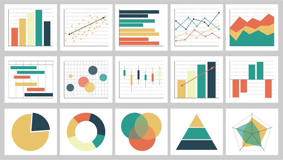
- Test different approaches: Experiment with multiple types of charts and visualizations, such as pie charts, bar charts, line graphs, and heatmaps, to see which one yields the most meaningful results for your research.
- Simplify the data: Try to simplify the data as much as possible to make it easier for viewers to interpret and draw conclusions.
- Consider colors: When selecting colors for your visualizations, make sure you use a limited palette of colors so that viewers can easily distinguish between different elements in the graph. Additionally, try to use contrasting colors to help emphasize the most critical points.
- Label information accurately: Ensure that all labels used in your visualization are accurate and presented, so viewers don't misinterpret any information.
- Follow best practices: Finally, always follow best practices when working with data visualization tools, such as making sure all sensitive customer information is kept secure, auditing systems regularly, and ensuring visuals remain.

Visualize Your Data With Brain Box Labs
Data visualization tools are potent for businesses and organizations looking to uncover meaningful insights from their datasets. However, it is essential to consider various safety considerations when working with these tools, such as keeping customer data secure, auditing systems regularly, and making sure visuals remain up-to-date, so any derived insights remain accurate. The tips in this article help you create compelling visualizations while ensuring the security of your customer's personal information.
Data analysts at Brain Box Labs can help you leverage the power of data visualization through our comprehensive suite of services and products tailored specifically for that purpose.
Brain Box Labs is the perfect solution to uncover valuable insights from your data quickly and securely. Contact us today and take advantage of our innovative solutions.