What are the Principles of Design?
Kris Nicolaou, September 16, 2022
In an increasingly digital world, your website's design plays a huge role in sending a message across. That's why companies invest in graphic design. Marketers understand that 40 percent of audiences respond to visual cues better than pure text alone. The reason is that a viewer's eye processes images faster than text.
With a dizzying array of websites competing for attention, users spend less than a second to form an impression. Your design must grab their attention in that time.
However, ensuring your web design is more than just visually appealing is equally essential. A good design should also serve some purpose and provide an excellent user experience. This is where the principles of design comes into play.
Key Takeaways
- Whether you are designing a poster, website, or app, many of the same fundamental principles of design apply.
- Knowing these design elements can help people better understand the design process and what it takes to create a visually exciting piece.
- By following these principles, designers can send viewers a clear message.
Emphasis
Knowing where to emphasize your design is critical. The specific element trains the viewer's attention to the focal point. Carefully placing different artistic parts makes it easier for the viewer to find vital information. In this case, the design process involves tweaking the shape, size, and colour to make it stand out.
Take the example of Apple's showcase of the iPhone 14 Pro. Notice how the text of the product is much larger than the tagline below.
The call to action (CTA) also stands out since it has a different colour scheme than the product name and tagline. Note that they also placed their newest products at the top of the page. There's an emphasis here because they want to sell it more.

It's common for brands to emphasize the CTA button on their landing page so customers don't miss it. Doing so brings them closer to the brand's goal of converting casual website visitors into actual customers.
In some landing pages, the design can present the text in different colours and fonts to make them distinct from the other elements.
Balance
Balance is another critical principle of art to apply when choosing the various elements to incorporate into your design. In design, these features have visual weight. It impacts how much attention it draws from the viewer and helps make sense of and absorb visual information.
Designers must position the different elements to distribute the visual weight evenly. Otherwise, some features may overpower others and appear chaotic to the viewer.
Imagine your design having two sides. The elements on each side must be visually balanced, so it becomes appealing to the viewer. This concept applies when doing a web layout. Ideally, balancing this visual weight is key to achieving harmony and providing a better user experience to users.
This balance doesn't mean that each side must always be on a 1:1 ratio. Below are the different forms of balance in design.
Symmetrical balance
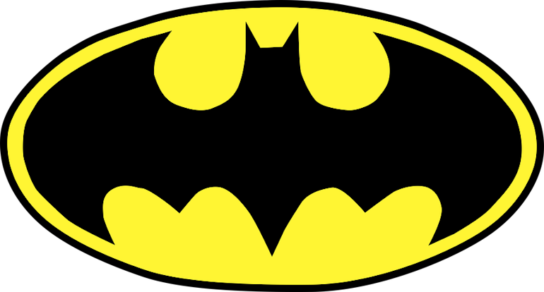
Achieving a symmetrical balance means splitting the design into two equal sides. It can be reflectional symmetry where the elements on each side have the same visual weight, creating a mirror image. Batman's logo perfectly exemplifies this type of symmetrically balanced design.
On the other hand, translational symmetry is where similar design components are present on both sides. These could be the same shapes or elements. It involves the use of repeating features or patterns following the same orientation.
Asymmetrical balance
In contrast to symmetrical balance, asymmetrical balance refers to using different features on each side. In such a case, one side may have one significant element while the other has multiple minor visual elements.
It can also mean having a big area with plain colour and balancing it out with a smaller space with a pop of colour. You can also balance out a complex shape with simple elements next to each other.
Radial balance
Radial balance involves achieving symmetry in several different directions. The principles of design apply to the visual elements surrounding a central point. While most radially balanced designs are circular, they apply in other shapes.
The design work can have depth and movement through the careful use of patterns. It can give a design a distinct characteristic that makes it stand out and grabs the viewer's attention.
Some radial balance designs include sun rays, spider webs, mandalas, and snail shells. They are also present in many everyday aspects, such as car wheels, dome windows, compasses, dartboards, and clocks.
Achieving a radial balance involves the creative use of geometric shapes and colourful elements that rotate from a central point. It helps create an engaging presentation that communicates harmony amid the controlled chaos of colours and patterns.
White Space
On top of balance, designers must also be mindful of the white space. It's an area that doesn't have any elements. Don't be confused about the term, however. This region doesn't always have to be white.
White space, also called negative space, doesn't have any images, texts, or drawings. It is simply empty. Despite its "nothingness," it's a fundamental building block of design.
Imagine a design with too little or no white space between elements. No matter how much balance and symmetry you put into it, it will still look cluttered.
However, the opposite is also true. White space must always be contingent on other features. Too much white space can also create a break in the design.
There are two types of white spaces. The micro space is the space between two texts or minor elements.
Macro space refers to the negative space between more prominent elements. These are common to see between images or videos.
Refer to the screenshot below:
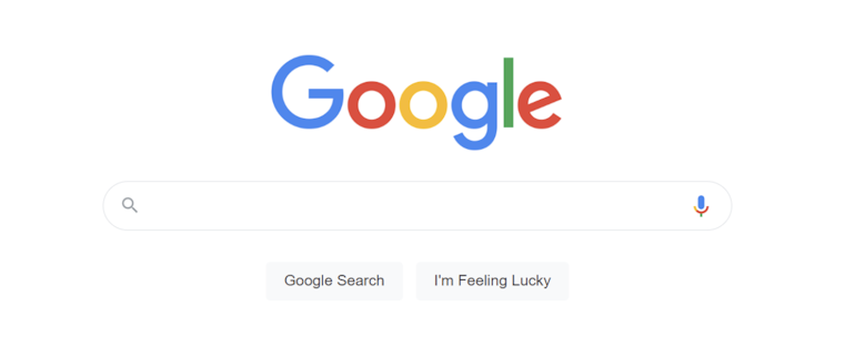
The white space between Google and the search box is the macro space. The white space between the words Google and Search is the micro space.
Contrast
Merriam-Webster defines contrast as "the juxtaposition of dissimilar elements (such as colour, tone, or emotion) in a work of art." It can also mean the "degree of difference between the lightest and darkest parts of a picture."
When applied in design, contrast means putting together visual elements that highlight their significance while keeping your design's visual appeal. It allows the most critical feature amid a myriad of colours and texts.
How do you determine where to apply contrast? Think about what part of your design you want the viewers to see first. Contrast effectively calls the viewer's attention to that area, distinguishing one element from another.
Using similar colour schemes, typography, and textures throughout can make the design bland. Adding contrast shows the viewers the order of importance.
However, designers must apply this with the visual flow in mind. Too much variation can confuse viewers, so it's crucial to maintain a cohesive design with contrast.
You can achieve contrast in various ways:
- Using different fonts
- Combining colours
- Experimenting with layouts and alignments
- Drawing various shapes
While it's great for marketing, overdoing contrast isn't advisable. Remember, your design should not scream contrast. Too much contrast will make your design chaotic as it can overwhelm the visual sense. Your design should still have enough matching elements to set the stage for the contrasting element.
HubSpot's landing page is an excellent example of using an adequate amount of contrast.
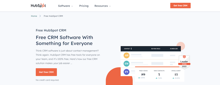
Notice the variety in the colours and the font used. The orange on the CTA button trains the eye to see it immediately as soon as you land on their page. The larger font adjacent to the smaller text highlights the message they want to convey.
As with other principles of design, the application of contrast should be in moderation. Adding too much can make the layout look cluttered and cause visual fatigue.
Hierarchy
Visual hierarchy refers to the design principle that places visual elements depending on their order of importance. This means putting a visual ranking according to content priority. Like with other design principles, it helps the viewer understand the logical flow and arrangement of the presented content.
Imagine you're browsing a webpage. The natural order of things is to scroll from top to bottom. The viewer's eye immediately goes to the item they see first on the page before they start scrolling. As such, designers should display critical information on the top page. See Samsung's landing page below:
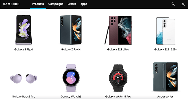
The concept of hierarchy is why most web pages have the same layout. On top of the page, you will see the logo. You will also see the dropdown menu where visitors can choose what page they want to explore.
The search functionality is also prominent, helping visitors browse more efficiently. Since they're selling smartphones, tablets, and smartwatches, the homepage displays these products as visitors' first items.
Some websites have a main heading and a call-to-action button on the top that emphasizes the page's purpose. The order of visual elements provides visitors with an organized view of your content, from the most to least significant.
There are various strategies to achieve this. You can adjust the scale and size so the most critical element gets the most attention. Adding a splash of colour and using contrast can make crucial features attract viewers. Making stylistic changes to fonts can also help train the eye to items you want to emphasize.
For hierarchy to work, most designers follow two standard patterns: Z and F-patterns.
The Z-pattern is best to use for web layouts that have more visuals rather than text. They scan from the top and diagonally downwards.
For text-heavy websites, the F-pattern is the better option. People naturally scan text in an F shape, so put the headline on top. The following text should go down and left before going down again.
Did you know?
Design to the edges refers to designing for as many potential people as possible. This is in contrast to the idea of designing for the average person.
Let Us Design and Develop Your Next Great App
Applying design principles involves more than aesthetics. Each has a specific purpose that allows you to convey your message with intention. With each appropriately placed design element, you can make a good and lasting impression on your readers and viewers.
Placing emphasis, maintaining balance, adding contrast, and establishing hierarchy in your design can make a massive difference to your brand.
How do you apply these design principles to your web page to remain aesthetic and functional?
Here at Brain Box Labs, we understand what it takes to design visually pleasing yet functional websites and web apps. Head on to our blog for helpful tips or contact us if you have any questions.