Web Layout Best Practices
Kris Nicolaou, February 18, 2022

Thirty-eight percent of visitors who check out websites for the first time look at their layout or navigation structure. This number is based on Top Design Firms’ 2021 survey and underscores how site visitors may leave if your website layout or navigation framework is not easy to follow or understand. So, if you are in the process of creating a website, you should employ a user-first approach.
Thinking primarily of your user applies to everything you plan to do for your website, including the web layout. So, ask yourself these questions before starting anything:
- What do you want your visitors to see when your site loads?
- How do you want them to find the information you are providing?
- How do you want them to see the products or services you are offering?
If you don’t have a clear answer to these questions, then this article is for you. Here we will tell you what a web layout is, how to create one, its common types, and its best practices.
Read on to know what it takes to create an effective layout for your website.
Website Layout: The Fundamentals
A website layout is a framework or pattern that characterizes the entire web structure. It presents the positioning of information and visual elements for the users and the owner of the website. A significant part of a website’s design, the framework is a vital component for the creation and maintenance of a website’s overall balance when it comes to content and other elements.
The main role of a web layout is providing clear navigation paths within a site’s web pages and placing the most essential website elements right where they can grab the most attention. It helps convey a site’s purpose, goal, and message effectively.
Website layouts also determine the content hierarchy of any site, whether it is built for a small business, a blogger, or an influencer. Content will not only direct site visitors to where they wish to go, but it will also tell them what you want them to know. Whether your message is that you’re there to provide a solution or to help them find the way to fix something themselves, a web layout will help them discover this.
Now, web layouts are not made haphazardly. There are fundamentals to their structure you should also know about. These include their goals, process, and the steps you need to follow to create them.
Website Layout Goals
Even a stupendous website layout can be problematic at times. After all, it is not the layout itself that visitors are after. So, more often than not, customers hardly notice the best web layout.
A great website layout can help your audience find the products and services you offer, the shopping cart, and the check-out button. Otherwise, they will pay more attention to figuring out how to navigate your website than its actual content.
While your website should be appealing to the eyes, it should also provide visitors with what they need as fast as possible. Keep in mind that a person’s attention span has gone down from twelve to eight seconds on average over the past decade. That is why your visitor’s first ten seconds on your website is crucial to avoid, or at least, reduce its bounce rate.
To help you discover your ideal layout, here are a few goals you should keep in mind:
Branding
Consistency in your web playout plays an integral role in strong branding. There must be uniformity in displaying your brand across all touchpoints, including your website.
Although brand consistency is mostly seen in your logo, colors, and iconography, it should also be present in the creation of your web layout. The spacing, position, and alignment of text and images must also be in line with your brand. The same thing applies to your message and voice. This is the best way for you to reinforce your aesthetics and value proposition.
Information Display
Since a web layout aims to balance every little thing on a website, it arranges information according to a visual hierarchy. It organizes all elements, including content, according to importance, allowing site visitors to scan a page quickly, without missing anything.
User Engagement
An ideal website layout engages users and directs them toward your content, helping them to navigate your site further.
Website Layout Process
Within the web layout process, art, psychology, and technology meet, combine, and evolve. This mixture of enthusiasm for art, technical expertise, and the perception of Human-Centered Design (HCD), when perfectly balanced, can generate more attention from your users, which can then result in increased lead conversion.
Before the creation of a web layout, website mapping occurs. This is when you establish your strategy. It is a prerequisite to creating the interface in any graphics program. This is then visualized into a skeletal map, also known as a wireframe, which presents how to fit the content altogether.
In a nutshell, website layout is only a part of a website’s design, but it is where most work is done through wireframing. Designs are patterned using a wireframe layout to maintain the balance of all visual elements.
Steps in Making a Website Layout
Knowing the process of creating web layouts or wireframes will inevitably lead you to the steps in creating them. You might have your own steps, but the most basic ones are the following:
1. Establish all areas for content.
Whether it's an image or a group of text, wireframes generally depict content using basic squares and rectangles. It is critical to know how much information you have and the approximate size of each component. That way, you have a precise way of putting elements together.
2. Create several prototypes or wireframes.
A good website layout can be as simple and plain as you want. But sometimes, you cannot achieve your desired result since wireframes are not for detailed artworks. That is why you should design more wireframes for more information and broaden your imagination.
These wireframes may serve as a practice to get more creative ideas. And no matter how amazing your original idea is, better ones will come out eventually.
Fortunately, you can use several programs and prototypes to streamline and enhance your process. You can improve user experience through the absence of fancy and distracting images. Creating several wireframes will help you find the most intuitive layout for your clients and their target audience.
However, be sure to consider your layout’s compatibility with multiple devices as these have various screen sizes. A rule of thumb for this is to start making layouts for mobile devices before proceeding with larger ones.
3. Test, get feedback, and repeat.
Once you have come up with your ideas, test them using interactive prototypes. This will enable you to test buttons and navigation even without an actual website. Seek ideas from your co-workers or get trial participants to screen-record their navigation trail. Once done, go back to the previous step and repeat the process until you perfect it.
This part of the process is an important step that allows you to get the most effective layout for your web pages.
Types of Website Layouts
Now that you know what a web layout is and the basics that come with it, it’s time to look into its more creative aspect. Although it’s hard to see the ingenuity of a wireframe or a layout, you can be sure that a high level of creativity is used in coming up with it.
Below are some of the most effective website layouts out there:
Single Column
Websites with single-column layouts are a great fit for mobile device users. It is one of the simplest web layouts, arranging all content in a single vertical column. Given its format, text and images are easy to read and follow.
Scanning is often done by simply scrolling down to identify the main points of the content. So, a single-column layout is best for websites adhering to minimalistic visuals. Blog sites and those publishing research and long articles may opt to use this layout.
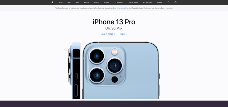
Apple uses this simple layout for the upper part of its homepage. It goes well with the high-resolution images of their newest products, succinct descriptions, and call-to-actions (CTAs).
Two Column
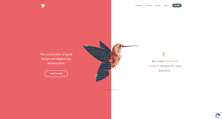
Two-column or split-screen layouts are also known as vertical-split screens. It displays two items of different areas but of equal importance. Web designers can present these items with equal consideration.
This layout is perfect for websites offering two different directions of the user journey, such as instructions or polls. It was used perfectly by a web design company that offers both web development and web design. This provides their clients a clear insight into their services.
Grids
These are more space-effective web layouts. They started as table-based layouts in the latter part of the '90s. Like card-style patterns, they are common for newspaper websites.
Grids are more organized, thus maintaining visual balance and order for easier content consumption. They are also flexible, so adjustments can be made as simple as card patterns. Most of these use twelve or sixteen columns with gutters in between.
Website layouts can make these grids prominent or subtle according to the placement of space elements. For example, baseline grids are used for horizontal spacing, which can help check line and body spaces.
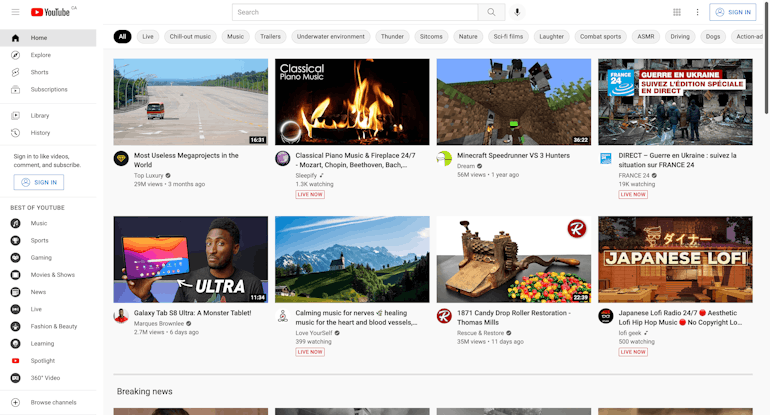
Sometimes grid structures can be challenging for displaying items with equal hierarchy on content-heavy websites. So, pay attention to white spaces to avoid content slippage. Even so, its flexibility provides more adjustment options to make browsing easier. For starters, use the basic twelve-column grid first. YouTube shows an effective use of a grid layout design, making it easier for users to choose the video they want to watch.
Card-style patterns
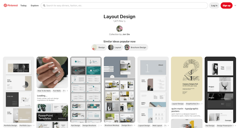
Card-style web layouts came out from the woodwork due to our favorite social media websites like Pinterest. This style has become a standard layout on news and blog sites. What is more appealing about this type of layout is you can place a lot of content on a single page.
This popular layout resembles physical cards and uses content blocks to separate everything. Card-style patterns can be fluid, so you can arrange them into orderly columns similar to what Pinterest is doing. Meanwhile, cards with equal dimensions can be placed on a grid, which suits more formal sites.
Cards are one of the most user-friendly patterns. They let users arrange content while keeping every piece distinct. The common problem a user may experience is the cluttering of the screen. Yet, it is something you can deal with easily as this design is responsive and allows you to rearrange content as needed.
F- and Z- Patterns
One common, but overlooked, problem among websites is that some have so much text, you cannot interact simply with their CTAs. That is why F- and Z-patterns are often used in visual and text-heavy websites. These can mimic the natural reading methods of many users.
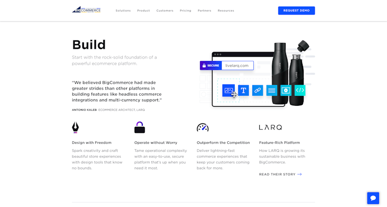
F-patterns are best for pages with so much content in terms of visual hierarchy. Content appears to be more prominent on the page top, with extra content aligned or indented beneath on every part of its left side. The content of Big Commerce as a whole looks like an F shape.
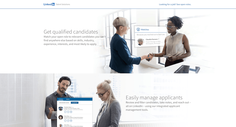
Meanwhile, Z-patterns have prominent content on the top part. But the way the extra content beneath every part is placed is different. Your gaze moves diagonally from the upper right to the lower left of the page. Linkedin is one website that has content arranged to resemble a Z shape. Z-layouts are best for two pieces of content with an equal level of relevance.
Single-page layouts
Since multi-page navigation can be convoluted, single-page layouts are practical choices for many businesses. It places all-important content on a single page. Instead of navigating on different pages, users only have to scroll down.
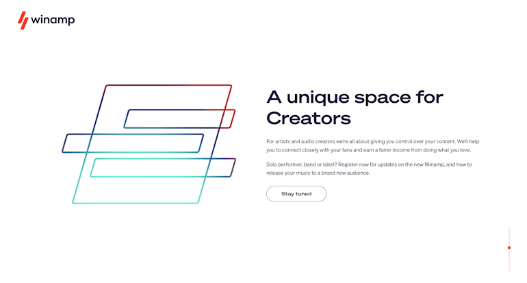
Many websites like Winamp have shortcuts that let users jump to a particular section or secondary page. These features help narrative content become interactive, not tedious.
Magazine-style Layouts
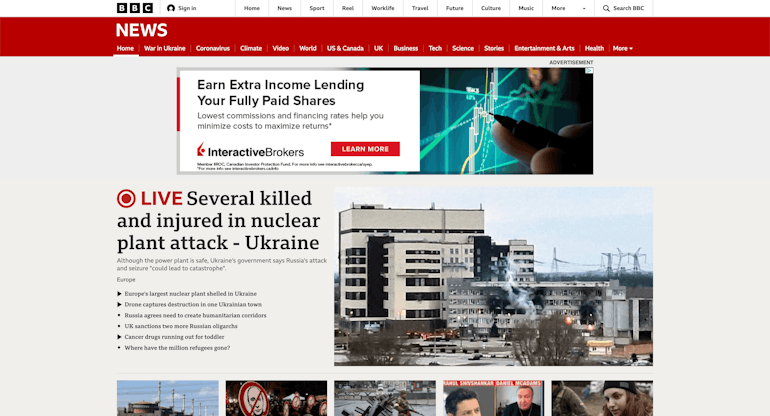
Web designs with magazine-style layouts are patterned from news and periodical products. Magazines were mostly available on news and magazine websites like BBC. But as time passed by, they extended to other related areas like e-commerce and blog websites.
This layout features a primary, secondary, and tertiary article in a carousel format and the like. Like the first layouts, they have multiple columns divided into sections.
Asymmetrical
When we hear asymmetry, we often associate it with imbalance. In essence, asymmetry pertains to inequality. The same goes for websites, as this layout plays with the rules of symmetry for uniqueness and perfection.
It creates dynamism and tension by changing sizes and colors, making visitors pay attention to every object. That way white space may not become a problem, and balance is achieved even if it seems impossible. This pattern has become a favorite among those creating websites in the world of art.
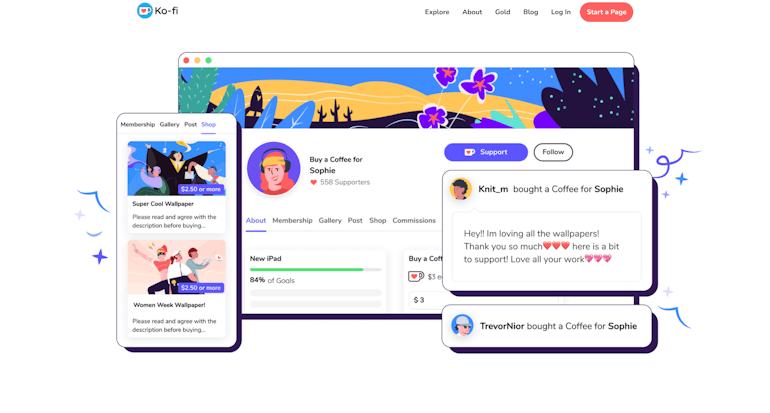
Ko-fi is a website for those who love arts, literature, and music. It is a good example of a site with an asymmetrical layout.
Best Practices in Creating Web Layouts
Aside from learning about the most common website layouts businesses use, you should also look into the best practices that go into creating these wireframes. Although the primary reason for visiting a website is the content, its design and layout are integral in generating leads.
Within five to ten seconds of landing on your site, people already have opinions about it. That is why you must ensure that you make your web design appealing and engaging, and this starts with an effective website layout. A good first impression can entice visitors back and inspire them to reach out to you.
Think of your website as a physical store, like a restaurant or coffee shop. Does it look bland and unfriendly? Is the lighting too dull or distracting? The same considerations should go for the online space that represents your brand.
You must show that you care about your customers by giving them an enjoyable experience. That means creating a space where people will visit and stay for support and solutions.
Design is a simple yet powerful and intuitive means to present your content to potential customers. It can help improve user experience with an easy-to-understand interface.
That is the reason website layouts are essential. As part of the web design, they should be as effective as your visual elements and content. Before you start, you must determine the best practices for creating web layouts that fit your business and goals. So let’s review the most popular ones currently out there.
Personalization
Personalization and customization are two similar but distinct web practices. They manage and shape a site’s content and features according to specific characteristics of visitors. When implemented correctly, they can help improve your website design and customer engagement.
Customization benefits the users. It allows you to change user experience based on your visitors’ needs. It involves the configuration of the ultimate web page layout, content, and system functionality. Moving items around the interface, changing colors, and choosing topics are part of it, as well.
Meanwhile, personalization can be done individually or by groups. Its function gives control to the web system. It tailors the system to determine the audience whose preferences match the content, experience, and functionality it offers.
Big Typography
Big typography styles have been around for a long time. However, it only became popular for web design with the prevalence of mobile designs. It is one of the most used patterns when creating headings and titles, although some websites also apply it to body copy to capture more attention.
It makes visuals more readable for a greater user experience, but keep in mind that it is best for minimalist designs, so you cannot combine too many other visual elements with it.
Asymmetry
Asymmetry is not practical for all websites. However, it can be of great help if you want to make your website lively, thus keeping a spotlight on your goals. It helps highlight the specific features without disrupting the visual flow. It also creates tension and dynamism, while still ensuring order.
Contrary to cards and grids, a web designer creates asymmetry from images and text that do not balance each other. Background elements using different patterns can also produce asymmetry.
It makes a website's design more energetic and vibrant, helping brands to communicate their image. Usually, these designs are remarkable and ideal for content that will not work in symmetrical patterns.
Visual Hierarchy
Visual hierarchy is one part of website layout best practices that is heavily related to simplicity. It pertains to the arrangement of website elements according to their importance. These can be arranged from top to bottom or through the use of primary and secondary pages. That way, visitors can determine and gravitate toward the primary, secondary, and tertiary elements or content when navigating your site.
With visual hierarchy, you can attain the primary goal of your website, which is to entice visitors to engage with your content. It lets you optimize usability, positioning, and design elements, such as color and size, to highlight the elements you want your visitors to notice. Naturally then, your visitors will follow the next steps you want, whether it is clicking a CTA, signing up for a newsletter, or browsing further on the website.
Intuitive Navigation
Intuitive navigation is one of the fundamental goals of developing and designing your website. It must have accessible and helpful content for solving complex problems.
The navigation structure should be simple, yet fast, so it does not feel like a treasure hunt to your visitors. Straightforward navigation makes it easier for visitors to explore your site and engage with your content. This can result in them going back to your website more frequently, thus generating potential leads.
How detailed your navigation links and steps should be, largely depends on your content. A few navigation links can be ideal for a web design with limited content. In comparison, websites with much more content need more links or navigation methods. For example, you can use mega menus to help users find and read the information they are looking for. This is one of the best practices in creating wireframes that will serve you well into the future.
PRO TIP:
"Layout consistency is crucial for your website. To avoid disrupting your visitor's navigation, all your pages should have the same layout and design themes."
Breadcrumb Trail
Breadcrumbs act as a secondary navigation system that shows the location of a user on a website. By clicking the back option or retracing their steps, they can find their way back to the previous page. This feature helps on websites with a lot of content.
Clear and Effective Communication
Language is one of the most fundamental parts of effective communication, so your website language must be simple. Use industry-standard words or phrases like "About," "Products," and "Contact Us."
Do not use unfamiliar words just to make your content different. It may lead to confusion and, worse, annoyance.
User-Centricity
User preferences should also matter when designing and making changes to your website, even with the web layout. After all, you have to design everything including the experience, enjoyment, and engagement. So this factor is the key to enhancing your website features and user experience.
Data and feedback gathering, user testing, and the implementation of changes are some of the best practices to achieve user-centricity. Testers should be those who have never been to your website. You may combine visitors' feedback with all the things you have learned so far.
Simple and Clean
A simple website layout and design affect how a user sees and digests your content. It will help if you are mindful of the amount of information and different design elements you present. Long walls of text, explosive colors, and confusing images can cause visitors to get overwhelmed.
Make your website easy, enjoyable, meaningful, and clean. Here, it’s best to remember visual hierarchy again, as it is always an important aspect in showing elements simply. The proper combination of colors and images with the sizes and positioning of the text will help you effectively arrange your content. Use white spaces according to the layout to keep your visitors' attention and make your website more appealing.
Appropriate Placement of CTAs
It is your web design’s aim to convert users or visitors into customers, and CTAs can help you attain this goal. But you don't want to provide too many CTAs, as these could appear baffling and become irritating adverts. Only use relevant ones, and incorporate them within your wireframe and content to entice your customers to the desired response.
Responsiveness and Accessibility
A website must be responsive and accessible at all times, on all devices. This is a part of web design’s best practices. Recent statistics presented that 90 percent of internet users are from mobile devices, such as phones and tablets.
The upward trend of mobile internet use is most visible in locations where mobile networks are the primary source of internet access. Mobile internet comprises more than 50 percent of the overall internet traffic.
As such, you should establish compatibility across multiple devices. Remember that a visitor may check your website using different devices all at once, so it has to be flexible and responsive to varying screen sizes without affecting their experience.
There are mobile-friendly HTML templates to help you do this. Making a special website for mobile users can help, too. That way, the appearance of your website remains consistent across different screens.
Moreover, your website must be accessible to all kinds of people. Accessibility entails making your website robust, understandable, perceivable, and operable. Plus, it can boost your popularity on social media sites, especially when users start talking about how convenient you make their lives for them.
But the more important feature your site should have, which you could attain through its layout, is its availability to persons with disabilities. Ensure to make their user experience as enjoyable as that of your other site visitors. Note that over one billion of the global population have limitations or disabilities. Among the best practices here, this one will get you an appreciative nod from many people.
Have a Web Design Idea? Let's Make That Happen!
Based on all the information you have read so far, it may seem that creating a web layout is not an easy task. It takes a lot of time, patience, and effort. Your wireframes can spell the difference on whether your website has a high possibility of generating leads or not.
While website design can be studied and learned by just about anyone, if you want to quickly and effectively have a website that will speak to your brand, it may be better to seek help from people who have extensive knowledge and experience in making beautiful web designs.
So did you find this article helpful? We have more you can learn from. Discover everything about web design and development by reaching out to BrainBox as soon as possible.
Our experts use only the best practices for the success of your business website. We develop and customize web applications, software solutions, and mobile applications. We also provide digital strategy and consulting services.