Psychology of Colors in Marketing
Kris Nicolaou, January 3, 2022

Ever wonder why you remember some websites and apps more than others? The colors these sites use might have something to do with that.
When it comes to marketing, one of the principles of good web design is choosing the right color palette. The primary purpose of employing marketing psychology is to capture and keep the attention of the target audience and increase conversion rates. The impact of color is an important factor in that, which is why when it comes to websites, design is king.
According to studies, color increases the level of visitor attention, which helps in retention. When a website or app catches your attention, you often look at it as a whole without analyzing the parts. You don't know why you find it attractive (or repulsive).
However, experienced marketers know all about the marketing psychology of colors. If you want to attract and keep your audience's attention on your website, app, or content marketing efforts, you should know it as well.
The Psychology of Color in Marketing
The marketing psychology of color primarily deals with people's emotional responses to specific colors, shades, and tints that can influence behaviour. In the world of marketing, color psychology is about evoking a positive perception that will persuade the audience to do a specific action (such as buying a product).
In many cases, people have specific color preferences for their clothes or cars because of how they want other people to perceive them.
- White: Young, modern, pure
- Black: Powerful, sexy, mysterious
- Silver: Innovative, modern
- Red: Confident, dynamic, exciting
- Blue: Trustworthy, dependable
- Yellow: Risk-taker, optimism
- Gray: Understated, wise
Of course, these are generalizations and the color selections may differ due to brand or cultural preference. For example, some people in warm countries choose white or gray vehicles to keep the interior from growing too hot. Other people may wear certain colors because it is the dress code at the office. But generally, people choose colors because of their psychological effect on them or other people.
The power of color in affecting human behavior is not a new concept. The ancient Egyptians studied the effects of different colors on moods to derive benefits from their use. This was long before Sir Isaac Newton identified the wavelengths of color or Carl Jung developed art therapy, referring to colors as the "mother tongue of the subconscious."
The belief in the power of color is so deeply ingrained, yet scarcely understood. Brands spend significantly on color psychology marketing and signature color creation. The focus is on brand recognition and has proven effective for some of the most iconic brands in the world.
For example, the red in Coca-Cola (Pantone: Coke Red; Hex color F40009) is so tightly interwoven with the brand that 94% of people worldwide reportedly identify it instantly. In a survey of 2,500 consumers, 84%, 80%, and 67% were able to identify the McDonalds, Starbucks, and Ikea brands respectively, solely based on the color palette. Ninety-one percent recognized Google.
How Do Colors in Marketing Influence People?
Does brand recognition using colors alone come before or after a brand becomes successful? That is an excellent question with no easy answer. Colors may have different meanings and connotations based on the context.
Color psychology marketing is only one of many factors that influence the buying decision. Yet, it seems to be one of the most impactful. One study suggests using the right color can increase brand recognition by 80%, and that people make a judgment and purchasing decision about the brand at least 62% based on color response.
There is no dispute that color elicits an emotional response. However, that response varies considerably depending on the context of the audience. A meta-analysis of several studies concludes that "[e]motions generated by the symbolism of colors are different in different populations and cultures."
For example, blue is often associated with creativity and calmness in the US (which is why it is a popular color for business corporation logos). However, people in Eastern Asia and Sweden consider blue cold and demonic, while the Dutch consider it warm and feminine. In India and Iran, blue has associations with purity and death, respectively. If your target market is Eastern Asia, you may want to rethink a blue color palette when designing your website.
Some patterns have emerged when it comes to branding and purchasing, indicating the effect of perceived appropriateness between colors and brands. For example, a brand that markets to young men may not find it appropriate for the logo or website to use pastel shades. The psychology of colors in marketing may sometimes seem sexist, but the reactions are subconscious. It is best to work with the most reliable data you have on hand so you can best speak to your target market.
Color Psychology Chart
Given the importance of context and perception, choosing the right colors to evoke the desired response from a target audience is a complex process. It requires a deep understanding of your target market and industry that may not necessarily correspond to the color Psychology Chart of the color wheel.

For example, a survey of 100 global brands reveals that 34% use black, yet none of the most recognizable brands by color palette (McDonald's, Coca-Cola, Starbucks, IKEA, etc.) use black. Among the brands that use black exclusively are Nike, Prada, Gucci, and Louis Vitton – all fashion products. The reason may lie in the association of black with elegance, luxury, and high quality in specific contexts.
There is no shortcut to creating the context for your brand and its audience. However, you can use the following generalizations for each of the most popular cool and warm colors as a jumping-off point for brainstorming your preferred colors for branding.
Red Color Psychology
Red is a warm and vibrant color, often associated with energy and passion. It can promote a sense of urgency because it raises the heart rate and blood pressure. Red comes off as exciting and attractive, which is why products ranging from lipstick to cars provide it as an option.
In marketing, retailers use red signs for sales and promotions to capitalize on their power to stimulate impulse buying behaviour. Red also enhances a person's appetite, so it is popular for many restaurants and fast-food chain brands. Website designers typically use red for call-to-action icons and buttons.
Good examples of using red for marketing include Target and McDonalds. The Target logo is deceptively simple but effective for brand recognition because it is literally a target in red. Would it be so widely recognized if the two concentric circles were another color? Probably not.
The red in the Target logo grabs attention, as does the red and yellow of Mcdonald's arches. Suffice it to say that red is exciting and attention-grabbing, and that makes it an excellent choice for a website.
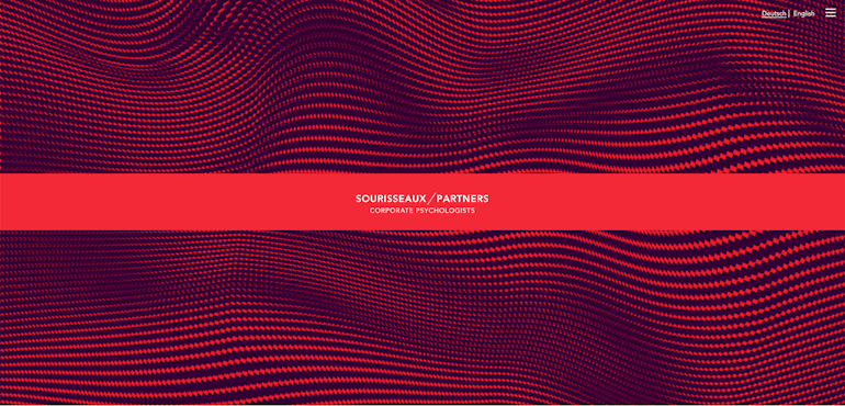
Using a lot of red can be risky, as it tends to be "hot" to the eyes when it comes to websites and apps. This site makes excellent use of different shades of red to guide customers.
Green Color Psychology
For people in the US, green is the color of money. For most people in the world, it symbolizes the harmony and balance associated with nature. It is a cool color that reflects a sense of vigorous life, health, growth, and peace in equal measure, and sometimes financial wealth. Green is the symbol of luck for some cultures.
When you use green for your brand colors, you are working with a delicate balance between nature and consumption, so you need to be careful with the context. Other associations with green include envy, jealousy, and physical illness.
Most people now associate green with environmental protection. You might be able to be a bit bolder in graphic design with your strokes using certain shades of green as opposed to other colors, especially when designing a website.
When it comes to marketing, the first all-green brands that come to mind are Starbucks and Whole Foods. It seems appropriate for Whole Foods to use green for their logo, given that they focus on providing natural and organic foods to their customers.
On the other hand, Starbucks has a more prosaic and quantifiable purpose for their color decision. The company chose green not for its emotional appeal but its high visibility during the day. The siren (mermaid-like creature) logo icon may have more to do with recognition than the color, but the green certainly makes it stand out more. As far as getting attention goes, it works.
This literally green website illustrates a well-thought-out use of shades of green for the best effect. Can you just feel that balance?

Blue Color Psychology
Blue is the favourite color for many businesses because it evokes a sense of trust and reliability. It has the shortest wavelength in the visible spectrum, so blues can be soothing to the eyes. In most cases, people choose blue for the workplace because it is non-threatening and creates feelings of security and tranquility. It also increases productivity in some people.
However, the psychological effect of blue will depend on the saturation and dominance. Intense blues stimulate cognitive thinking while softer shades calm the mind and promote concentration. Using too much blue can make you feel sad (hence the term "feeling blue") and give off a cold and distant vibe. In some cases, the initial feeling of calm upon entering a blue room can fade over time, replacing it with a sense of isolation and depression.
When choosing blue for your website or app, make sure that you don't overdo it. Used in the right amounts, blue can help build trust and engage customers, which is probably why the best tech brands like it so much. Blue-only iconic logos include IBM, Samsung, General Electric, and of course, Facebook (now Meta).
This website makes excellent use of shades of blue to denote calmness in logic. Do you feel clearer in your thoughts?

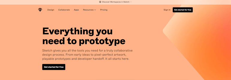
Orange and Yellow Color Psychology
While most people associate yellow with positivity, it is actually a practical color that stimulates analytical and creative thinking. It encourages people to innovate and actively find solutions to problems, which is probably why it generates optimism and open-minded mindedness. People attracted to yellow often like how it can project a can-do attitude.
Because yellow has an exceptionally long wavelength, it is one of the first colors you will see in any light condition. Children’s toys are often in bright colors such as yellow because kids are more attracted to them. This makes yellow a great color to use for logos and marketing campaigns. However, yellow tends to incite aggression in some people, especially introverts. You might want to temper the cheerfulness down by using orange instead.
Orange combines yellow and red and tends to be more comforting than either of those primary colors. It inspires a feeling of enthusiasm without overwhelming you with the positivity of yellow. People use orange to denote safety and caution (think orange traffic cones or safety vests) as well as practicality, such as with Home Depot. If you want to denote a safe space for troubled times, orange is a good option to deliver your message.
Good examples of all-yellow brands include Snapchat and Mailchimp. All-orange logos include Nickelodeon and Etsy. When it comes to websites, this one is a great example of the friendly vibes orange can project. More orange than yellow, but still positively creative.
Purple Color Psychology
Purple does not typically occur in nature, so creating dyes in that color used to be difficult and expensive in ancient times (with the exception of the bright indigo plant). Because it is not a common color, purple was often reserved for the wealthy and royal, leading to its association with both wealth and privilege.
Purple also inspires feelings of energy and stability, thanks to the combination of red and blue. Some find it spiritual, while others associate it with wisdom or courage (hence Purple Heart). However, purple can also be a rather sombre color, making it too depressing for some people in large doses. Used judicially, it can elevate an app or website to interesting heights. The communication platform Discord uses a light lavender for its logos to suggest calm, friendly communication.
Purple-only logos include the luxury brand Asprey and the sci-fi channel Syfy. For websites, this one was attention-grabbing.

Black Color Psychology
Black is not technically a color, but a shade in the absence of light. When producing black in paint, it is all the colors combined. So it is not surprising that it can sometimes be overwhelming in large doses.
Despite this, many brands use black because it exudes strength and power with a tinge of mystery. Some people have negative associations with black, such as death and sadness. But overall the connotations are sophistication and independence (think of Coco Chanel’s classic little black dress). The fact that black is a neutral color also helps, and that includes apps and websites.
As previously mentioned, many fashion brands use black to denote either strength or sophistication. Websites can be a little tricky, as an all-black site can be difficult to perceive. But using black is a great way to create startling contrasts. This one is an excellent example of that.
Gray Color Psychology
People associate gray with wisdom and neutrality, mostly because gray hair often comes with age. But it also connotes elegance and practicality in equal measure because it lacks extreme qualities. In some instances, gray can be sombre and serious, the color of agreement and compromise (making it suitable for business attire). But used too much, it can connote conformity and a lack of expression.
Designers often use gray to mute more exuberant colors, creating transitions to pull contrasting colors together. However, gray can also be depressing when used in large quantities, so it is wise to use it in moderation for a color palette. Silver, a metallic grey, often signals that something is clean, expensive, or tied to technology.
Brands that use gray logos include Apple, Lexus, and Mercedes Benz. The effect is often clean and thoughtful. Websites often use gray as a background with significant results, such as this one.
White Color Psychology
White is not actually a color, but all colors in the visible spectrum combined together. Inpaint form, it is the absence of color. This may explain why it is associated with purity and cleanliness. On the flip side, it can also denote emptiness and absence, which is not always a bad thing. A white slate, after all, is a symbol of new beginnings, infinite possibilities, and the creation of ideas.
Minimalist advocates love to use white for designs because the color association is with cleanliness and neutrality. While it might not be the most striking color choice for brands, it can be used to significant effect in combination with other colors.
The Lego logo, for example, is always white with different background colors. Many top brands favour white-on-black versions of their logos depending on the campaign and target audience. State Farm’s red logo is often paired with a white background to suggest a sincerity behind their bold attitude.
Very few would not have white space when it comes to websites because it is a fundamental principle in design. However, some sites like this one really push the envelope with minimalism. It's intriguing, isn't it?
How to Pick Colors for Your Business Branding
When choosing the colors for your website that will promote your business branding, it is essential to take a holistic approach. It is not just about choosing colors you like, but how they will create the structure for the information you want to present to the audience.
You need to choose the colors for data visualization that will tell your site visitor about the different types of data and their relationships. Since reactions to different colors may vary for different audiences, you will need to work closely with UX and UI designers to understand your vision for the website and your buyer personas. Together, you can create a suitable color scheme for your needs by answering the following questions:
How do you want to display the data?
- Sequential or quantitative – Use gradients of one color, from high to low
- Diverging - Use contrasting colors on extreme ends of the category, with a neutral color in the middle
- Qualitative – Use different colors for each data point to illustrate that the data cannot necessarily be directly compared
How many unique colors do you want to use?
The number of unique colors you use in a display will depend on the number of categories you want to highlight. The use of unique colors indicates that data points are not related or comparable.
Will you use preset color schemes or create your own?
You can choose colors for your scheme or use a tool to select them for you. Colorpicker for Data, for instance, will allow you to choose a unique color and use a locator to identify the hues and gradients that go with that color. On the other hand, Color Hunt presents you with a broad range of color schemes from which to choose. Each one comes with a score, so you know the schemes that designers and artists like best.
| 5 Commonly Used Marketing Psychology Principles | |
|---|---|
| Reciprocity Principle | The Reciprocity Principle is primarily a quid pro quo (something for something). The idea is that people are more likely to do what you want if you give them something else first, such as a discount on their first purchase or for signing up for a newsletter. |
| Information-Gap Theory | The Information Gap Theory works on the idea that if you tell someone you know something they don't know about a topic of interest, they will take action to acquire it. That is why how-to articles are so popular. |
| The Scarcity Theory | The Scarcity Theory operates on the feeling of FOMO (fear of missing out) that drives people to buy products they don't need because it's being offered to them exclusively, at deep discounts for a limited time, or has limited stocks. |
| Social Proof Theory | The Social Proof Theory relies on people's tendency to follow the leader when they are not sure what to do. Celebrity endorsements, influencer marketing, and user reviews result from this theory in action. |
| Loss Aversion Marketing | Taking elements from the Reciprocity Principle and Scarcity Theory, the idea behind Loss Aversion Marketing is that people don't like losing something they already have. For example, they are more likely to buy something if it comes with a freebie. |
If you would like more information about color psychology and its relevance to your overall digital marketing, get in touch with the experts from BrainBox Labs. We design, develop, and market intuitive web applications that improve your business.
“Did you know that people make subconscious judgments about a person, environment, or product within a few seconds or minutes? Therefore, color meaning and the psychology of colors can powerfully impact people’s behavior and decision-making.”
- BrainBox Labs
Need Help with Your Digital Marketing Project? Get In Touch with BrainBox Today.
Who knew that picking colors for a website could be so complicated? However, it would be best to give this decision the bandwidth it deserves so your efforts don't go to waste. Eliciting the desired emotional response and engagement from your target audience is part of what makes a digital marketing strategy effective. That includes choosing the right colors from a psychological perspective for your website, logos, and marketing campaigns.
If you found this article helpful, we have more coming your way. Visit our website for more useful information on building a website, marketing, and developing apps.
If you found this article helpful, we have more coming your way. Visit our website for more useful information on building a website, marketing, and developing apps.
If you are struggling with your website design or any digital marketing project, you can avoid the stress by letting the pros handle it for you. At BrainBox, we make a point of understanding the needs of our clients and their business so we can deliver websites that work well, marketing plans that deliver on their objectives, and web applications that solve business problems.
Contact us now so we can talk about your goals.